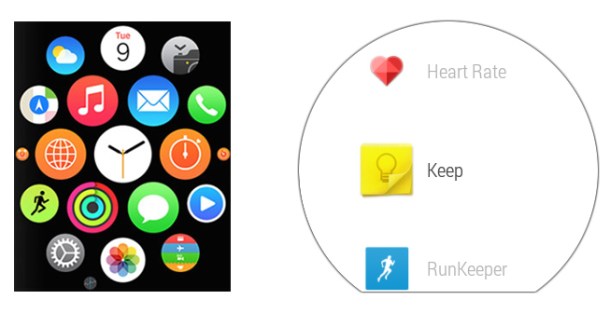
One thing that Apple has always done exceptionally well is to make clean, intuitive user interfaces that don’t overload you with too many unnecessary distractions. That’s why it’s somewhat surprising to see, at least at first glance, that Apple’s Watch UI looks much busier and cluttered compared with the more minimal approach taken by Google with Android Wear.
Read more here:: Boy Genius Report

